Last Updated on April 24, 2019 by Micha McLain
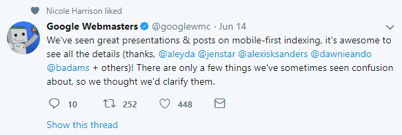
Google has released some clarifications on mobile-first indexing since our first article so we thought we’d go over them quickly since we just talked about mobile-first indexing two weeks ago.
Google Wants to Set the Record Straight with Clarifications on Mobile-First Indexing

As can tend to happen on the internet, there was some confusion and probably a lot of misinformation floating about. These updates mostly reinforced things that were said in our previous article, but if Google thought it was necessary to clarify then we think it’s worth revisiting as well. If you didn’t read our first article about mobile-first indexing this can serve as a high-level overview of the most important (and apparently misunderstood) parts.
Crawls Will Shift to Mobile from Desktop Versions but Stay Relatively Consistent

There may be a temporary increase in the amount of webcrawls Google does while switching from a mobile index from a desktop index, but Google is very much trying to play down the perception of any meaningful and noticeable changes happening due to the transition. Generally speaking this is not overly important, as you should still be focusing on doing good white hat strategies for your SEO regardless of how often Google crawls.
Mobile Friendly or Mobile-Responsive not Required but Recommended

Your site will be indexed regardless of whether it is mobile-friendly or mobile-responsive, but as Google says:
It’s about time to move from desktop-only and embrace mobile 🙂
Seriously though, there’s no good reason to be desktop-only still and lots of reasons to be mobile-responsive!
Google Will Show Desktop to Desktop and Mobile to Mobile but Index Mobile

Some people who have separate websites for their mobile and desktop versions (not necessarily recommended) were worried that desktop users would now see the mobile. Google will still be showing the correct version to all viewers based on their device, but indexing mobile.
This means that it is important to make sure that all your content that you want to show up for SEO reasons is just as easily available on the mobile version of your site, otherwise your rankings could suffer.
The Speed Update is Separate from Mobile First Indexing

In July Google is making mobile speed a ranking factor. This is supposed to only affect the worst (longest to load) of mobile sites, so in most cases it is not supposed to have any noticeable effect. To find out more about the speed update you can take a look at the Google Webmasters blog post. They have a number of recommendations for what you can do to test your site there for those that are interested, but if you really want to test I would recommend putting your url in at PageSpeed Insights. It won’t always give you a score, but if it does then that is the quickest and easiest way to tell how your site is doing.
Even when a site is really slow that doesn’t necessarily mean that it will be knocked down in the rankings, as while speed is important, it is still only one part of a much bigger picture of Google ranking factors.
Web-Light Updates Rolled out in Search Console

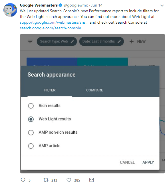
This is something we didn’t talk about in our previous article, and kind of an unrelated update put between a number of mobile-first indexing clarifications. Web-Light is where Google detects when mobile users are on very slow networks and transcodes the page to reduce load time significantly (up to 80%). They have found that this makes it so slow pages get much more traffic from users on slow networks. There is now an update in Search Console so you can look at your results from when this happens.
In the bigger picture this is not going to be worth worrying about except for people who might be targeting users in rural areas or places with bad cell coverage. Even then, it is worth taking a look but there is no need for action on your part unless you find that the way Google is transcoding your page is unacceptable for some reason.
Hamburger Menus and Accordions are ‘fine’ to Use

Google wants users to get the information they are looking for as fast and as easy as possible. If your accordion helps to do that, then it is probably a good thing. If it is not helpful then it will probably count against you. Make sure you don’t have a high bounce rate for any pages with accordions.
Hamburger menus are pretty standard on mobile, as they allow for taking up minimal space while not in use, but also make it easy for people to read the available options when in use.
Other Resources for Mobile-First Indexing

If you want to look further into mobile-first indexing details straight from Google you can follow any of these links:
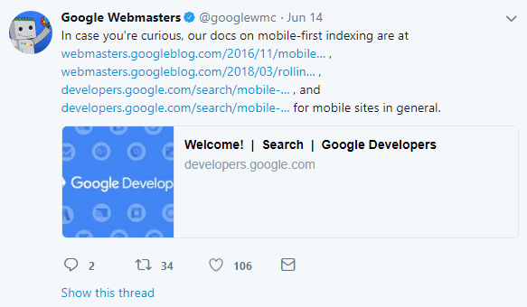
In case you’re curious, our docs on mobile-first indexing are at https://webmasters.googleblog.com/2016/11/mobile-first-indexing.html, https://webmasters.googleblog.com/2018/03/rolling-out-mobile-first-indexing.html, https://developers.google.com/search/mobile-sites/mobile-first-indexing, and https://developers.google.com/search/mobile-sites/ for mobile sites in general.
No Real Surprises from Google with these Clarifications
Nothing here is overly surprising or different from what was originally said by Google, it just seems that they saw enough misinformation out there that they thought it was necessary to set the record straight. Part of the challenge in general is that Google is often not going to tell the whole story, so there is naturally going to be speculation about how true some things Google said are going to be.
Is Google Mobile-First Indexing Really not going to Affect Rankings that much?
According to Google it isn’t. From the information they have released it seems it is actually a goal to not affect the rankings that much. Mobile speed and mobile experience are only two of many different factors for search results, so even some sites that have bad and/or slow mobile experiences could still maintain high rankings if they are definitely the best option.
Solid Foundational SEO Means Mobile-First Indexing Largely Irrelevant
Having a relatively fast (mobile and desktop), mobile-friendly or mobile responsive website is what is most important to not be adversely affected by these updates. As long as you have these two things going for your site and don’t have a mobile version of your site that has less content available than your desktop version you should be relatively unaffected. However, that also just means that you shouldn’t lose ground, but you probably won’t gain ground either.
If you want to actually improve your SEO take a look at our post on local SEO and Google 3 packs or you can get in touch with us about SEO marketing.
Hopefully that should be something you have already focused on, in which case you are good to go. If your site is lacking in any of these compartments and you don’t know how to fix it (or don’t have the time) it is probably the time for some professional web design.
