Last Updated on December 18, 2019 by Ryan Hamner
Google’s Mobile-First Indexing is being implemented as the trend worldwide continues to shift towards more mobile users of the internet.
This means it is time for you to make sure your website is mobile-friendly and fast enough before your site gets penalized in Google’s rankings. Want to find out if yours is? Here’s the two tests you can take straight from Google to find out:
Functionally speaking, if you pass the two above tests and your site displays the same content on mobile as it does on a desktop you should be relatively unimpacted by these changes.
If your mobile site displays less than information than your desktop site that’s a potential problem you will want to address immediately, as once Google stops indexing your desktop site that information will be lost and no longer used for rankings.
There is no set launch date for Google’s mobile-first indexing, as it is a slow rollout that will continue to involve a lot of testing. The pace of implementation will greatly depend on the success of the rollout as it goes, but anyone who waits is playing with fire.
Want to find out a bit more about what the Internet Gods are doing?
Let’s find out why this is happening and what it means. Want to find out the most important things for getting to the front page of Google and staying there? They still haven’t changed!
Now More Mobile Users than Desktop Users Worldwide
Here’s a look at the data from Statista:
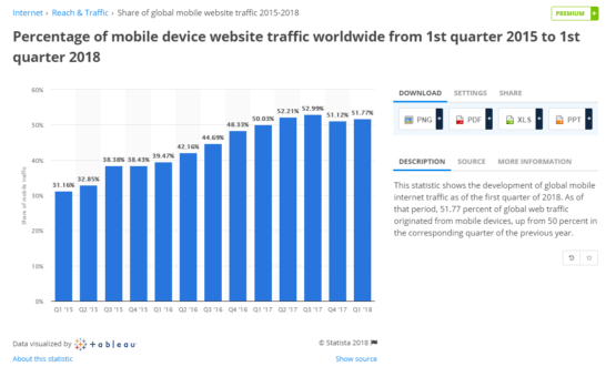
2017 marked the first year that mobile internet users is now more than desktop users globally, with 51.2% globally using smartphones or other mobile devices. Progress has slowed and fluctuated up and down in the last five quarters, but the overall trend is still very strongly upwards. In just 2015 only 31% of internet users were viewing on mobile devices and we’re already over 50%!
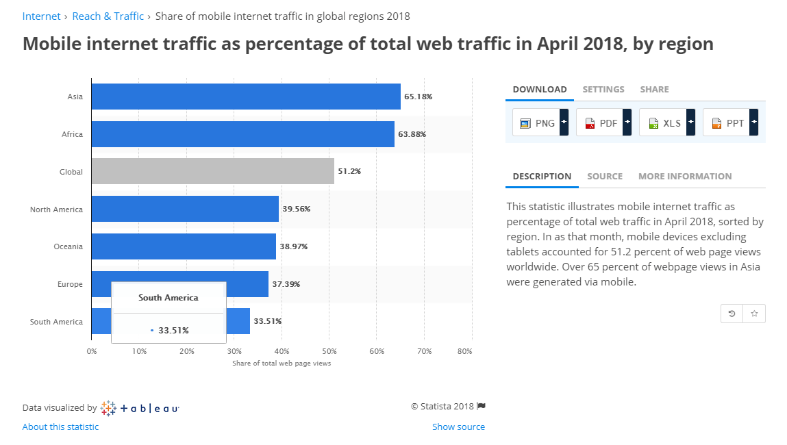
Keep in mind that this is worldwide, as in the US there are still more people accessing the internet on computers (about 40%). It is mostly places like Asia and Africa where computers are less plentiful in the general population:
This trend will top out at some point, as there is a finite level of growth that can happen before there is some sort of natural balance. I would imagine Google has put in some research into where they think that balance will be and that they are comfortable that it will be well over 50% and that is why they are making these changes. There are also some serious potential downfalls to having a desktop first index that are not present for a mobile-first index, as discussed below. That could also be a big part of their decision.
What is Google’s Mobile-First Indexing?
Straight from the horse’s mouth (Google):
“Mobile-first indexing means that we’ll use the mobile version of the page for indexing and ranking, to better help our – primarily mobile – users find what they’re looking for.”
There is Only One True Index, and it is Shifting to Mobile
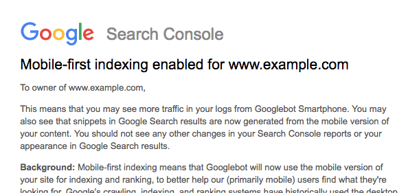
There is only one set of search results (not separate results for desktop and mobile), and it is transitioning to being based on your mobile sites instead of your desktop sites. After a year and a half of testing Google is now building its mobile-first index, and when your site is included you will get a message via Google Search Console that looks like this:
This continues to be a transition in progress and Google notes that sites that only have desktop versions will likely continue to rank for the time being on desktop searches, but they ‘continue to encourage webmasters to make their content mobile-friendly.’
You Will be Penalized for Lackluster Speed on Mobile by July 2018
“…beginning in July 2018, content that is slow-loading may perform less well for both desktop and mobile searchers.” – Google
Keep in mind that what is slow loading on desktop and mobile is often different, as mobile users tend to be using data where desktop users will be using wifi and will have more capacity.
Since loading times were based on a desktop first index the mobile load time was not incorporated, but now that a mobile index is being incorporated this is a new factor.
While Google does note that having mobile-friendly content will help for showing up in mobile searches, for right now they are building up their mobile-friendly index but not necessarily changing the results. For now, but not forever.
This is not something you want to wait for. Hopefully, you should already be ahead of this, but if not, then make no mistake: now is the time to fix it.
Google does mention that speed and mobile optimization are only two factors of many for ranking, so at times there may be a top result that shows up that is not mobile friendly due to Google still believing it to be the best answer.
For Most Websites This Will Have Minimal Impact
At this point, most sites should be taking mobile seriously and have either a good mobile version or a responsive site that changes based on the size of the screen.
However, just because you have a mobile version does not mean your rankings will stay the same, as Google is always adjusting to make sure they are providing what they think is the best answer to the searcher’s question.
Advantages of Mobile-First to Desktop (or Laptop) First Indexing
Google has always used desktop versions of sites to find the best search results in the past. When people click on the results they will either see the desktop version, the mobile version, or a responsive version based on their device.
Since most users were on desktops it made sense to prioritize this way. However, this could also create bad user experiences when users were on mobile and the site was either not well optimized for mobile or was actually broken on mobile.
Since just about every website is either designed on desktop first and adapted (responsively, with AMP or otherwise) for mobile, or is designed specifically to be used the same across all devices (this is generally referred to as mobile-optimized) there is not the reverse issue of pages with good mobile experiences having bad desktop experiences. Check out our in-depth previous posts if you want to find out more about Google ranking factors in our case study.
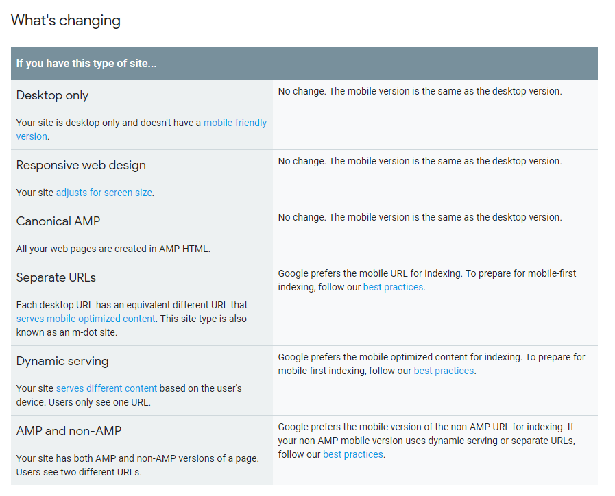
Here’s a summary of what will happen for each different type of website from Google:
Generally, if someone is designing something for a mobile device that is not meant for a desktop they will just make an app!
If someone comes across a site that is optimized for mobile but not for desktop please post it in the comments!
A Few Milestones in Responsive History
Originally websites were just designed for desktops, but once the proliferation of smartphones took hold that slowly started to change. According to Wikipedia:
- The first layout to adapt to user viewport was an Audi site in 2001
- It wasn’t until 2008 when the term ‘Responsive Web Design (or RWD) was coined.
- 2013 was coined ‘The Year of Responsive Web Design’ by Mashable.
Now in 2018, the tides are turning and we are beginning the year of Google’s mobile-first indexing. Mobile responsiveness or mobile-friendly is no longer just ‘recommended’ or ‘best practices’, it is about to be a requirement.
However, if you really wanted to show up well in searches it was already a requirement.
What’s Next?
What’s on the horizon? For most businesses a website with responsive web design is all they need.
There are some new exciting things on the horizon for those pushing the envelope, and they are called progressive web apps. They are essentially a middle ground between a website and an app, which can be downloaded to your phone and will load reliably instantaneously.
These generally take a more mobile-first approach to design, but can still be used on desktops. This will be overkill for most small to medium size businesses unless they have specific needs that would require them.
While there is no need to get into progressive web apps if all you need is a website, if you think you need an app they can be a great compromise that offers the functionality of both a website and an app and it will be exciting to see more of them in the future!