Logo Design
Schön Cues is a pool cue manufacturer founded in 1981 and their name, “Schön,” is the German word for beautiful. A fitting name as they handcraft beautiful pool cues that are just as much works of art as they are precision instruments for professional pool players and part-time enthusiasts alike. See how MVMG approached an innovative, modern new logo design for this well-established, in-demand company while still staying true to their core values and personality.
Problem
Overcoming an Established Bias
When it comes to a major design change to an already established brand, one has to tread carefully. The original logo shown here had few variations of this similar calligraphy look and had quickly become a recognizable logo sononymous with quality. The owners wanted a completely renovated logo update to replace this over two decades old design that would better suit their name, their company values, and compliment their new modern website.
Original Logo

Strategy & Solution
New Branding


A Modern Look With Purpose
The main motivation behind this new logo design was ensuring that it was easily recognizable, unique, and would complement the brand’s new modern website design.
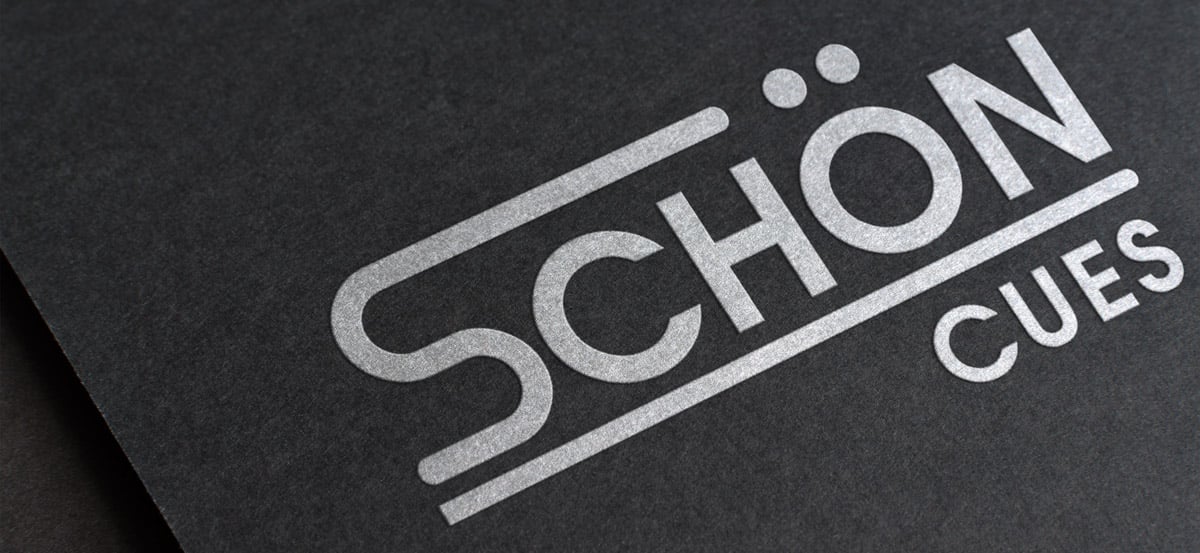
We kept their main color scheme of black and white. Usage of black in design is associated with power, authority, and strength– while white has the connotations of cleanliness and perfection. It’s a timeless color palette that exudes balance and timeless beauty and is fitting for the level of craftsmanship and detail that goes into making each cue.
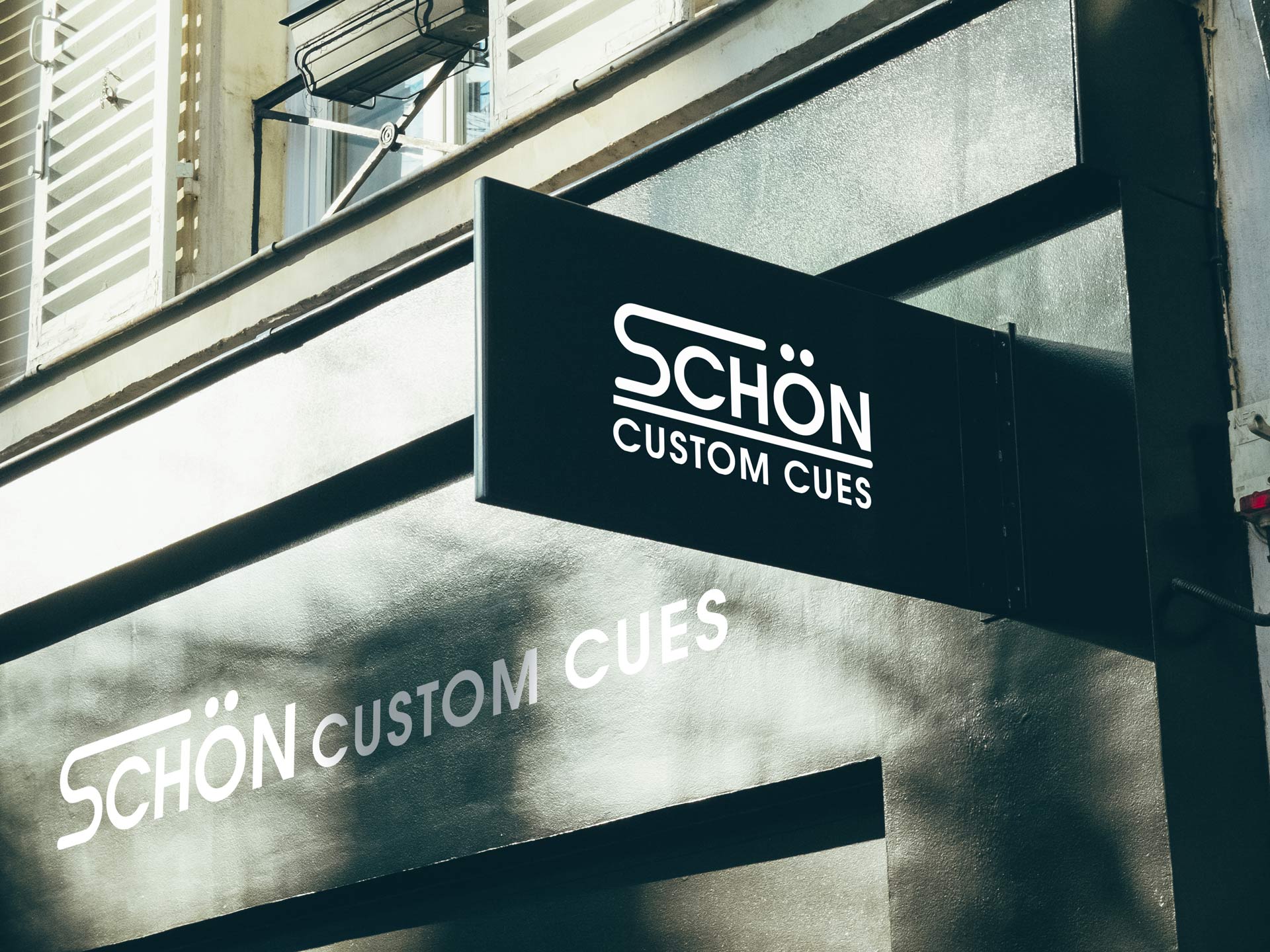
The logo design itself is a fun play on the umlauts over the “o” that are incorporated with the extended arm of the “s” to allude to a pool cue aimed at a cue ball and pool ball. It’s a subtle design that doesn’t detract from the name, is well balanced and easy to read, and is a stellar example of positive modernization of a brand.
I strive for two things in design: simplicity and clarity. Great design is born of those two things.
– Lindon Leader
Think Modernization is a Challenge?
Fill out the form below for your first step torward a solution.
Fill out the form below for your first step torward a solution.