Logo Design for a Rebrand
This mother/daughter duo run an online marketplace that features products for a cause: a portion of all the proceeds of each sale goes to charities and causes around the globe. Everything from unique jewelry finds and travel tumblers, male skin care, to concealed carry purses, this online shop has gifts you can feel good about buying for yourself, your family, and your friends. See how we accomplished bridging the tastes of two generations together for their new brand representation.
Problem
Old Name, New Outlook
This family-run company originally started out as “Ryan’s Daughters,” however, they were looking for new, unique branding that was more fitting to their mission and values rather than focusing on individuals. With an upcoming name change and complete website overhaul redesign, they were looking to modernize and freshen up their brand.
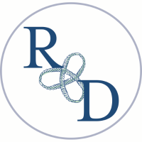
Original Branding
Strategy & Solution
New Branding
![]()
After a Major Name Change…
This family-run company originally started out as “Ryan’s Daughters,” however, they were looking for fresh branding that was more fitting to their mission and values rather than who they were. That’s when Altruist was born. “Altruist” is a person unselfishly concerned for or devoted to the welfare of others- which is the core mission of their company.
The colors of the logo itself were carefully chosen as well for their symbolism congruent with their mission. The dark rose/pink is a color that stands for universal love of oneself and of others and the complementary silver embodies sophistication and modernism. The circle around the monogram A is also a strategic symbol. Using a circle causes any who view it to be drawn in and to be included in the experience of whatever symbolic message the center may hold. The entirety of the branding and design is simplicity and femininity and evokes the feeling of love for others– drawing people together for a common cause.
A brand is the sum total of how someone perceives a particular organization. Branding is about shaping that perception.
– A. Freidlein
Think Re-Branding Your Company is a Challenge?
Fill out the form below for your first step torward a solution.
Fill out the form below for your first step torward a solution.