Last Updated on July 17, 2018 by
An online assessment is a perfect way to assess 2016 and figure out what goals to set for your online strategy in 2017. Everyone sets personal New Year’s Resolutions so why not set some for your business?
The only problem is where to start.
How about improving your online presence?
Just about everyone can use a better online presence. Even a service professional like a dermatologist who already has their schedule maxed out could focus on getting more of their ideal clients by generating more of the appropriate content.
Who could use an online assessment for their online presence?
Everyone. Technically maybe not everyone, but pretty darn close.
If you are a single practice doctor, accountant or other professional service provider that has no interest in expanding and already has a surplus of new inquiries of your perfect client type then no need to bother.
If that is you, then congratulations on a great 2016!
Otherwise let’s get on with our online assessment so you know what you can do better in 2017.
What is Important for an Online Assessment?
We’re not trying to cover everything here, just some of the essentials. For most businesses this will still give them plenty of ideas for what to work on in 2017.
We’ve broken it down into 4 categories:
- Website Design
- Website Content
- Social Media
- SEO
While SEO is the most important, we saved it for last because it is also the most complicated.
We’ll start our online assessment with website design.
Online Assessment Section 1: Website Design
What Makes for ‘Good’ Website Design?
This can be hard to quantify or make concrete, but there is one big thing that design should not do. Your website design should not scare away your viewers. Ideally it will lure them in and make them want to read more. At worst it should not be a determining factor, but it should not be repelling your viewers.
You should be able to get a good idea by just looking at your site, but if you are unsure you’ll want to find out if your bounce rate is higher than it should be. If so you might have a problem.
What’s Above the Fold?
Make sure that everything important that you want your viewers to see is ‘above the fold’.
What does that mean?
That means that viewers don’t have to scroll down to see it. At times this can be a complicated thing to measure because of the way many websites change their appearance based on the size of the display they are on.
While some estimates are up to 75% of people do not even scroll on websites, others are as high as 75% of people do scroll on websites. Regardless of how many people scroll, everyone does agree that content below the fold is very much viewed as secondary in importance.
And not everyone does agree that not everyone scrolls down, so make sure that if they need to see something it’s above the fold.
To give you an idea of how common website issues like this are, I chose to search for something random (plumbers in Denver, no publicity is bad publicity right!) to find our examples for both our good and bad sites. I have also included a quick comparison of search engines to illustrate the difference of usage of white space, but other than that we’ll stick to plumbers today.That means these examples are not as extreme of examples as they could be, but the point is that these things happen across all websites and are not that hard to find. So they could be on yours.
That means these examples are not as extreme of examples as they could be, but the point is that these things happen across all websites and are not that hard to find. So the good or bad parts could be on yours. Make sure to check.
Bad Use of Above the Fold
With the first notice the bad use of space above the fold, the intense color scheme and lack of white or empty space.
While the placement of these major buttons below the fold is probably an unintentional accident, they clearly meant to have their intense color scheme. If that fits with your branding it could potentially work, but be aware that it is not going to be for everyone.
Look at the difference between these two examples.
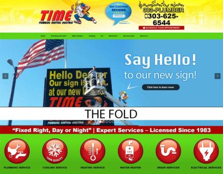
Do you think it was their intention to have all of these buttons below the fold? They seem pretty important, right? Especially since their menu options are so small in comparison!
Good Use of Above the Fold
Maybe they intended to do something more like this:
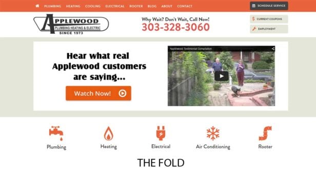
Since there’s only so much room above the fold that means you’re going to have to prioritize a bit. That’s a good thing, as too many choices can often be overwhelming and lead to the only choice being made to be hitting the back button.
If they do that it causes you to lose a potential customer and can have a negative impact on your SEO rankings, especially if they do it quickly and do not engage at all with your site.
Make sure to properly prioritize what’s above the fold.
White or Empty Space
A website packed with content is neither pleasing to the eye nor inviting to the mind.
Make sure to have some empty space. One of the most popular websites in the world is a master at use of white space, you might have seen it:
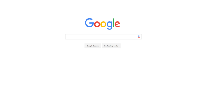
While you don’t need to model your site off Google and you probably shouldn’t, note the difference between Google, Bing and Yahoo. Google has by far been the #1 search engine for over a decade (keeping the same design) and here’s Bing, the #2 search engine:

Still a nice website and the obvious focus is to get you to search for what you are looking for. There’s some small distractions at the bottom. Then on to the #3 search engine:

Not only is this homepage quite busy, but the header is a huge in your face ad. If all the search engines returned the exact same results (which they don’t, Google tends to be better at getting your meaning instead of searching for exact keywords), which one would you use? I’d certainly order them in the way they’re ordered here, which is also the order people use them. Google, Bing then Yahoo!, but presentation is important. Make sure you’re only putting important information that adds value on your site, make sure it is easily readable, and limit distractions.
You want users to be able to easily find what they are looking for as quickly as possible.
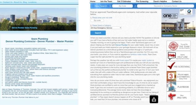
Bad Use of White Space (Back to Our Plumbers in Denver)
Would you read through all this text on either site or do you think they should rethink their presentation?
Better Use of White Space
Would you rather read one of the homepages above or the one below? Which is easier to read and faster?:
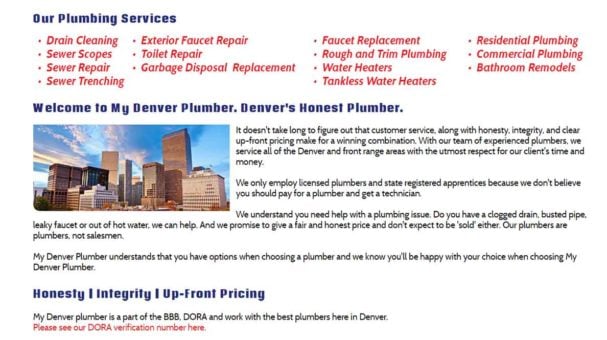
While this example may not be something to model your site after, it utilizes white space better than either of the others above. The bullet points are easier to read because they are bigger and have more space between them. The paragraphs are also easier to read because they are significantly smaller, allowing more white space to come through.
Make it a pleasure to read instead of a pain so people don’t leave your site.
If you don’t think you’re an accurate judge of your own site ask a couple other people’s opinion.
Is Your Site Scannable?
People don’t sit down to read a website like they do to read a novel. People will generally scan your website to see what it’s all about before deciding if it’s worth their time to read it.
Do you use headers well? Can people get the gist of your site without searching for the main points in the text?
Notice that headers are not used in either of the two examples lacking white space above, but they are in the one below. Makes it easier to see what he’s talking about, doesn’t it?
Keep your paragraphs shorter than you would in your English papers.
Is a Dark Background and Light Writing OK?
Be careful with black or dark backgrounds and white writing. Yes, it can make your website stand out. Whether that is good or bad is in the eye of the beholder. If you have no other reason for doing it other than to be different this is dangerous territory.
A poll on ProBlogger found that 47% of people who responded always preferred white and 10% of respondents always preferred dark, with the rest in the middle.
While their poll is far from scientific, they are not the only place to find most people prefer white or light backgrounds.
Just keep in mind it was an almost 5 to 1 ratio of people who always preferred white to those who always preferred black.
For the most part it comes down to eye strain. Is your font big enough so people don’t have to strain to see it? Then you might be OK.
Just make sure you do not have small, thin fonts on black or dark backgrounds. And make sure the font is very light colored so it stands out.
Don’t underestimate how finicky website viewers can be. Err on the side of caution when it comes to readability.
Mobile Responsiveness
This is super important. About 50% of all website views are on smartphones now and that number is only increasing as smartphones become more powerful and prominent.
Mobile responsiveness has also increased in importance in SEO algorithms for search rankings.
Curious about your website’s mobile responsiveness? Check your mobile responsiveness with Google. If we had to choose one thing that was most important from this online assessment this would be it.
If it isn’t mobile responsive you have a big problem. You could be losing 50% or more of your visitors to your website because the site doesn’t work well with their phones, which is going to further hurt your SEO rankings.
Feel free to call us or another web designer to get it fixed, but do it now. Our number’s in the top right if you need it.
Online Assessment Section 2: Website Content
There are a few simple things that are very important for website content:
- Is it easy to understand?
- Is the information on your site valuable to your client?
- Do you have Call To Actions (CTAs) on each page of your site?
Easy to Understand Content
Don’t use superfluous words like superfluous.
People are generally trying to read quickly, they’re not looking for a vocabulary lesson.
While inevitably your site will have to use some jargon specific to your area of expertise make sure to limit the big words to when you need them to convey extra meaning.
If people can understand what you are trying to tell them with the least amount of effort possible that is perfect.
The more effort they have to put in the more likely they are to leave.
Is Your Website Content Valuable for Your Clients?
Make sure the content on your site is meant to inform your potential clients on things that they will want to know. Every website that is looking to get new visitors from Google should have a blog.
That blog should be centered around the concerns and questions your potential clients might have. It should post quality content regularly, but it doesn’t have to be all the time. If you have the choice of posting worse content more often or better content less often, do the better content.
The more useful information you can offer in your blog the more your clients will trust you. The more they trust you the more likely they are to come to you when they have problems that they can’t solve themselves or through your blog.
Make sure to Write for Your Clients and Not for Your Peers
This may sound stupid, but we see it a lot. People like to write about what they’re comfortable with, and sometimes it will be on new tools or gear and how it’s going to make their own life so much easier.
Your clients could care less about how it makes your life easier. What are the potential benefits for them?
Make sure your blog is focused on delivering valuable content for your clients, not your peers and you’ll be off to a great start.
Online Assessment Section 3: Social Media
Which Social Media Channels to Use?
This is intimidating for most professionals. Which social networks to use and how often? We’ll give you some quick and easy guidelines to go by.
The big three to pay attention to for social media are Facebook, Google+ and Twitter.
Don’t worry about the rest. If you’re already using something else and have good traction with it, feel free to keep going. Otherwise don’t worry about it.
Consistency of Your NAP is Really Important!
Make sure your name, address, and phone number (NAP) are consistent across all channels. This is very important for SEO, so make sure it makes it on the to-do list.
How often to post?
If you’re a small business, posting 2-3 times a week is fine. For a bigger business 3-5 times a week is a better target.
Ideally your posts will be tailored to each individual channel, but if you don’t have the time it is ok to post the same or similar messages to all of them.
Just make sure that your messages don’t go over character limits or run into other technical issues if you are trying to post across all channels, as they do have different formatting requirements.
Keep it light
Social posts should be light and interesting.
Your post is going to have a lot to compete with to grab attention. Keeping it as fun, light and interesting as possible while still staying on brand will help you gain attention.
If you have enough content that you can post your own content most of the time that’s great, but make sure to occasionally post interesting external links as well.
Nobody likes it when all somebody does is talk about themselves all the time. Same goes for social media. Share other people’s content occasionally as well, as long as it’s not your competition’s. Duh.
Should I do paid campaigns?
To start, probably. It’s very hard to grow a following as a business on social networks without running paid campaigns at the beginning. Facebook is continually limiting the amount of organic reach posts that businesses have, even to their own followers. So getting people to like your page no longer gets much free publicity.
If you have someone who specializes in social media then you might be able to get away with not doing paid campaigns, it’s worth the investment to get you started. Social doesn’t do any good if nobody knows about it.
Keep in mind that regardless of whether you do a paid campaign or not it will take awhile to get traction, so be patient.
This is a long term strategy.
Online Assessment Section 4: Search Engine Optimization (SEO)
Now for the most important and most complicated part: SEO.
This is also the hardest part to do in an online assessment unless you use some sort of tool to evaluate your SEO more fully.
In this section we will give an overview of what SEO is and what are some of the most important parts of SEO, but if you really want to see where you’re at take a look at our resources section or learn more about local organic search with our Guide to Local SEO and Local Google 3 Packs.
What is SEO?
Google and other search engines have web crawlers that comb the web to find the most relevant content for the people using their search engines.
These crawlers have become much smarter over recent years, but they still don’t see webpages anything like humans do. Various strategies need to be utilized to ensure that they can understand as much as possible about your website as possible.
Showing up in search results can change your business forever, but it doesn’t happen overnight. It usually happens after multiple months of concerted effort.
For most businesses that means starting to see significant returns in 3-6 months and very significant returns in a year. Once that initial build up takes place it is easier to maintain, but without maintenance those efforts will fade over time as well.
What Does it Mean to Put Effort Into SEO?
There are a lot of different aspects that go into SEO. Here’s a brief overview of some of them:
- Blog posts on appropriate keywords (find these from keyword research)
- Images with appropriate title and alt tags in posts
- Video with appropriate titles, descriptions and tags
- Quality backlinks from other sites to your site
- Time your domain has been established
- Load speed (faster the better!)
- Content that draws people in so they stay on your site for longer
- Good clean code (complicated, but not for here)
- No broken links to pages or posts on your own site (internal links)
- Minimizing broken external links is good for user experience, but nowhere near as important
While we’re on the subject of broken links, you should check your site for broken links.
There’s a lot of technical aspects to SEO. Many little things behind the scenes (in your code) will tell Google and other web crawlers the things they need to know about your site.
For better or worse SEO is not something we can just give you a few pointers for and you’ll be good to go. It will take more than a simple online assessment to figure that out. Be careful about trying to do your SEO yourself, as if you do anything wrong it could lead to your site being flagged by Google and penalized, sometimes harshly.
Make sure a pro does your SEO, as it will be worth it.
Concluding our Online Assessment
This article is meant to give you some starting points for doing an online assessment of your website. At this point you should have some ideas of what you can work on for 2017.
Keep in mind that while SEO is the most important of all the areas we talked about, every other portion will feed into SEO and work with it in various ways.
There are certain things that are done only for SEO (like alt tags), but most things that are done for other reasons (website design) could have effects on SEO in various ways.
Anything that causes your website users to stay on your site for longer will have subtly affect your SEO in a good way, and anything that causes them to leave quickly will affect it in a bad way.
All those little details can add up to good search engine result rankings. Or subtract to bad ones.
Make sure they add up to something big for you.
Want to do an Assessment of your SEO? Here’s some Resources!
We have a couple ways you can do an online assessment of your SEO to get an idea of where you’re at. We also have a number of articles on local SEO:
- Small Business Guide to Local SEO
- Local SEO Services: A Big Deal For Small Business
- How to Choose the Best Local SEO Services
- Local SEO & Marketing Tips: The Ultimate Guide
For a quick customized 12 page report that analyzes one page of your website for the keyword of your choice you can use our free SEO Audit tool.
If you already know a bit about SEO and want to do a more in-depth analysis of your full website and how it stacks up against the competition you can try out our SEO Rank Tracker and SEO Software for free.
If you want to go beyond what just technology can show you and get a professional opinion on how your website is doing overall and relative to your top 3 competitors you can talk to Multiverse about getting an Online Visibility Report for your business.
