Last Updated on June 13, 2022 by James Castro
A logo is a building block of your branding, and as such, it should create an immediate impact and visual connection to your brand’s identity. It should grab attention and unlock memories, feelings, and associations.
Designing a memorable, recognizable logo is crucial for any business, organization, or entity looking to gain recognition and build a brand. The right logo can be the difference-maker between potential customers choosing you over your competition. As one of the first visual touchstones of your company, considering how to design a logo should be taken very seriously.
Before you start: BRAINSTORM
A great place to start when you’re ideating for your new logo design is by stepping back to truly understand your company and brainstorm what the perception of your brand should be. Think about: your company’s core values, your industry, and even what some of your competitors are doing.
What jumps out at you? How do you want to reflect that in a logo?
Does your name lend itself to be shortened, or fit fully within a logo? Are there any visual elements, icons, or potential “mascots” that fit right away based on your name (think the Twitter “bird” or Wendy’s….Wendy). Sometimes the answers jump right out.
All of these foundational questions play an important role. Your logo will not only be the visual representation of your company across all mediums, it will also dictate the majority of any branding and marketing efforts going forward.
What’s the key takeaway from all that? Start with brainstorming what feeling, message, or symbolism you want to convey to those who view your logo. Step outside the thinking of WHAT your company does and focus on the WHY. That WHY should come through in the symbolism of your logo
So whether you’re starting a new business, or re-examining your current branding efforts, here are five elements to consider when designing your logo.
1. Your Choice of Brand Color
Generally, color is one of the first places to start with when it comes to your branding… and any brand colors should be reflected in a logo as well as any branding moving forward. Deciding on color can be tricky, and almost always there’s a good bit of psychology involved.
CHECK OUT MY RECENT POST ABOUT COLOR PSYCHOLOGY AND BRANDING!
For instance, 33% of the top 100 brands predominantly use the color blue in their logo design. The color blue is commonly linked to soothing feelings of calm, security, and intelligence. You might choose blue to invoke a sense of trust and serenity in customers.
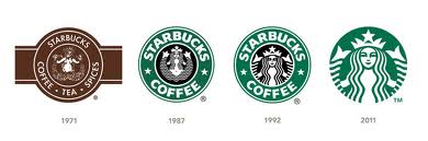
Nearly 85% of consumers name color as the primary reason that they purchase a particular product. Finding a signature color or colors plays a huge role in brand recognition. Think about how that specific shade of green has become synonymous with the Starbucks brand.
And even though there are what we consider to be commonalities in color branding – tech companies lean towards blues, environmental companies choose greens- don’t be afraid to venture into shades not typically seen in your industry if you feel they’re the right fit for you. Basically, regardless of what your competitors use; you can always try to bring something “unique” into the industry as a strategy to stand out.
Also, according to some interesting statistics of top big brand logos, less is apparently more when it comes to choosing your brand colors:
- 95% — Use one or two colors
- 33% — Use the color blue
- 29% — Use the color red
- 28% — Use black or gray-scale colors
- 13% — Use yellow or gold colors
- 5% — Use more than two colors
Obviously, there’s an exception to every rule when choosing your brand color (and design in general), but unless you’re selling rainbows like Crayola or Skittles, try limiting your logo design to only 1-3 colors max.
2. Symbols and Structure
Now that you have a general idea about what basic, foundational components to consider when starting to design a logo, you can start moving forward on some of the more visual elements beyond color.
Now, the text is definitely important in most logo designs (more on that later), but the right structure really sets up your logo for success or failure. Especially when considering that our brains process images 60,000 times faster than words.
The basic rule of thumb is that a truly effective design should be simple-– this creates immediate recognition. Think of the Nike swoosh, Apple’s apple… and even the Starbucks Siren, which although may initially seem pretty involved and complicated, it still has a clean simplicity to its design.
According to an in-depth brand analysis done by the people over at HubSpot, they found that:
“…no matter how big a company gets, there will still always be people who don’t recognize your brand or understand the brand sentiment they’re supposed to feel. The Starbucks logo has always had the text “Starbucks Coffee” surrounding an image of a twin-tailed mermaid, also known as a siren in Greek mythology, which is indicative of the company’s heritage from the Pacific Northwest. For those who were unfamiliar with the Starbucks logo, the addition of these words has always helped to explain what the logo represents. However, in 2011, Starbucks updated its logo to get rid of the words and leave the mermaid, in hopes that they had enough brand recognition.”
HubSpot
Important structural elements to consider include:
- Symmetry – ensures balance, is visually pleasing, and creates harmony with every piece of the logo.
- Shape – from text to graphics, everything that makes up a logo takes on a specific shape.
- Texture – create a “feel” by bringing elements from the physical world to your visual logo (think conveying a brick wall or glass bottle)
- Line – emphasize points, create divides, and direct eyes to a point of interest.
- Framing – organize and create a visual hierarchy.
One of my all-time FAVORITE logo designs in terms of creativity is Spartan Golf Clubs. Check out their use of dual symbolism of both a spartan and a golfer swing:
All of these visual concepts can seem overwhelming, but you should consider every angle (literally!) when undertaking something as serious as logo design. And once it’s done it should set you up for years to come!
Now, not all logo designs require iconography to be effective. Many successful brands have created Word Mark logos. These are uniquely styled text logos that spell out the name. Many times, custom fonts are created specifically for brands to use across all their marketing and branding- think Facebook or Sony. And this is a great way to segue on into our next section…
3. Typography
Helvetica was first introduced in 1957. Since then, it has remained one of the most popular and recognizable typefaces in any medium. Most of the time with fonts and branding, playing it safe with a highly-legible font and sticking to what works is a good bet.
However, when using a font as popular and saturated in the market as Helvetica, there will most often be more pressure on other touchpoints, such as iconography, color palette choice, etc… to develop and enhance the design’s personality.
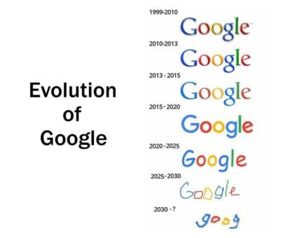
Recent years have brought the minimalist movement and with it a rise in sans serif fonts. Brands like Calvin Klein, eBay, and Yahoo have all adopted sans serif fonts. Even Google swapped out its old serif logotype in 2015 for the more contemporary sans serif version you see today.
While modern trends are great and can help dictate what direction you decide to go in, also don’t be afraid to explore more forward-thinking approaches like hand lettering or scripts. Do your research and decide what best fits your brand identity. But whatever you do, please don’t use Papyrus as your font of choice!!!

4. Adaptability/Versatility
An extremely important element to remember when designing a logo is adaptability. Remember, this logo is going to be used (or should be!) within every aspect of your branding. Much like modern websites are responsive in design to fit any screen, your logo needs to be able to adapt easily as well.
Be sure that your logo can be adaptable and effective in any medium, including:
- Social media profile photos (300px X 300px max)
- On your website (which we can help make great!)
- Merchandise, if appropriate. (hats, t-shirts, stickers, pens)
- Printed promotional materials (flyers, business cards, product labels)
- Advertisements
Another important thing to consider is that if your logo design cannot be viewed legibly or easily in black and white- that’s usually a bad sign. Although we live in a very digital age, there are still many offline and print locations where a logo may need to be used in black and white or single color. There are workarounds that can be done, however viewing how your logo will look in black and white before solidifying your design needs to be taken into consideration.
Another issue we’ve seen in poor logo designs is scalability issues. If there are elements or details to your logo design that can’t be seen or get lost in smaller sizes- i.e. your logo in your website menu bar, you’re going to have a bad time.
A logo that’s adaptable will grow in recognition. If your logo is accessible in any medium on every platform, you’re giving yourself the chance to be seen by more people. And more eyes mean more opportunities for new business!
Consider that out of the 40 million or so images posted to Instagram every single day, the Starbucks logo finds its way in around 10,000 of them, one way or the other. Every single day. That kind of organic reach is the ultimate goal for logo design.
5. Timelessness
Obviously your goal in designing a logo should include being unique and memorable. But an important facet of being memorable is also being timeless. The right logo and branding works for decades.
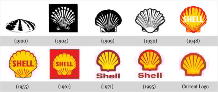
Slight tweaks over time are appropriate and even expected (see: Google, Microsoft, Apple, Starbucks…again). But the core elements of your logo should be able to stand the test of time. See how Shell Gasoline’s logo design has been tweaked over time yet still recognizable:
So basically, standing the test of time comes with an understanding of balance. Leveraging new trends and taking advantage of a design that fits modern platforms is definitely important. But the core elements of good design haven’t changed greatly.
Keep your design simple, versatile, and impactful for the best results.
Finding your unique place between tradition and modernity will help your branding become a cultural fixture in your industry.
Time to Grow!
At the end of the day, a strong logo should help your company achieve its goals and most importantly, grow. A great logo will improve your visibility and marketing efforts, which should in turn be a cog in your overall strategy for more business.
Conversions are key to business growth, which is how we approach branding and web design at Multiverse Media Group. You’ll need a fresh digital space to show off that new logo, and we specialize in building and maintaining beautiful websites every day that help our clients grow.
The web experiences we develop only use modern strategies and techniques to better position our clients for the future. We know how confusing and frustrating it can be for small businesses to navigate a competitive digital landscape.
We design websites that lead to more conversions. Not only will you rank better than your competition, but you’ll have the opportunity to gain more leads, which means better growth for you and your business over time.
Reach out to us today and get started with your new website. Whether you’re starting from scratch or just looking for a redesign, we’re here to help.